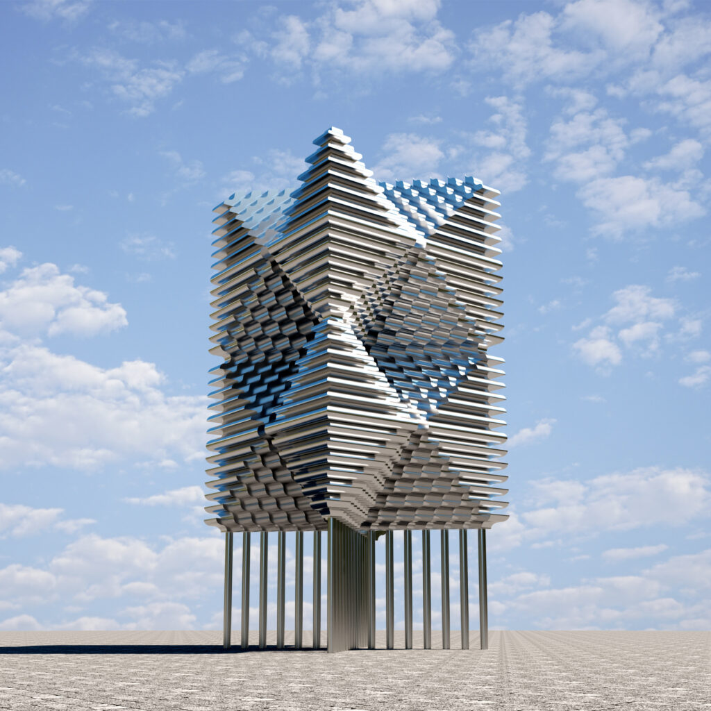
TELOFLUX

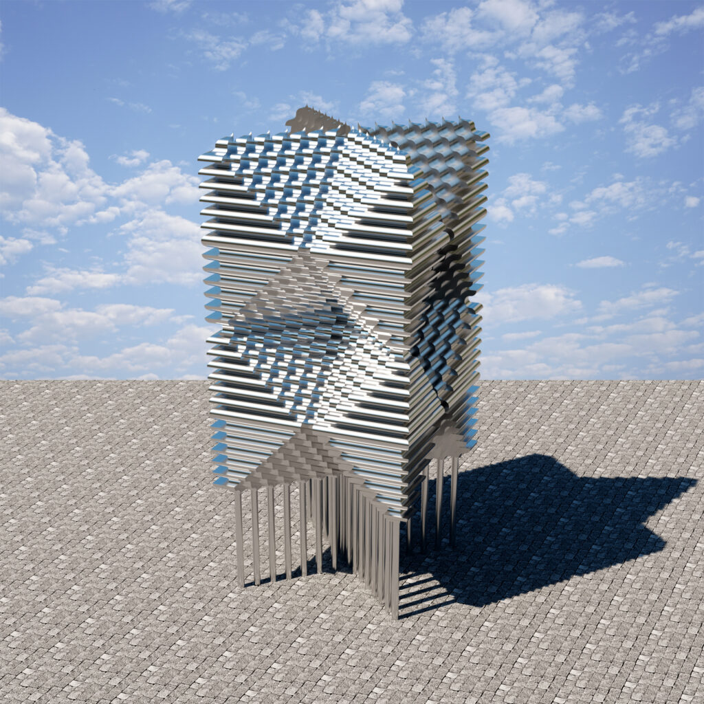
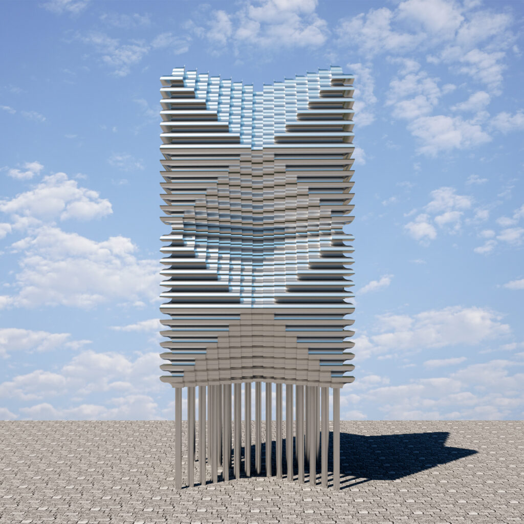
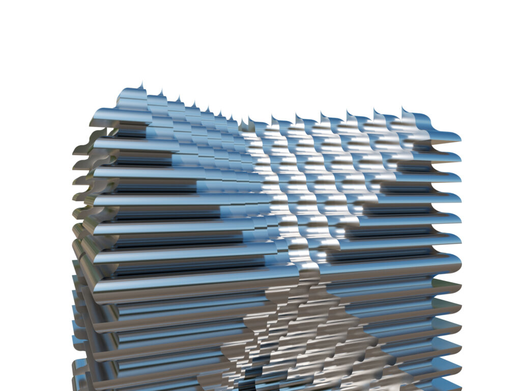
TELOFLUX continues my explorations of geometric forms challenging myself to merge the visual arts and architecture envisioning geometric structures that blur their boundaries.

The title TELOFLUX derives from the Greek word Telos meaning complete, final, perfect and Flux referring to something that is not done, moving, flowing, changing, evolving. I like contradictions.

Animation of TELOFLUX

Music: from the original soundtrack to the film METROPOLIS: I. Auftakt: Metropolis Thema, composed by Gottfried Huppertz, perfomed by Rundfunk-Sinfonieorchester Berlin conducted by Frank Strobel

click on images to enlarge (except mobile devices)

#techspressionism #artandarchitecture #architecture #conceptualarchitecture #3d #blender #geometric #sculpture #conceptualart

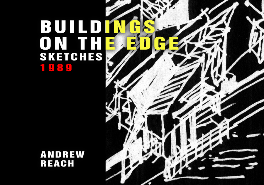
Buildings on the Edge

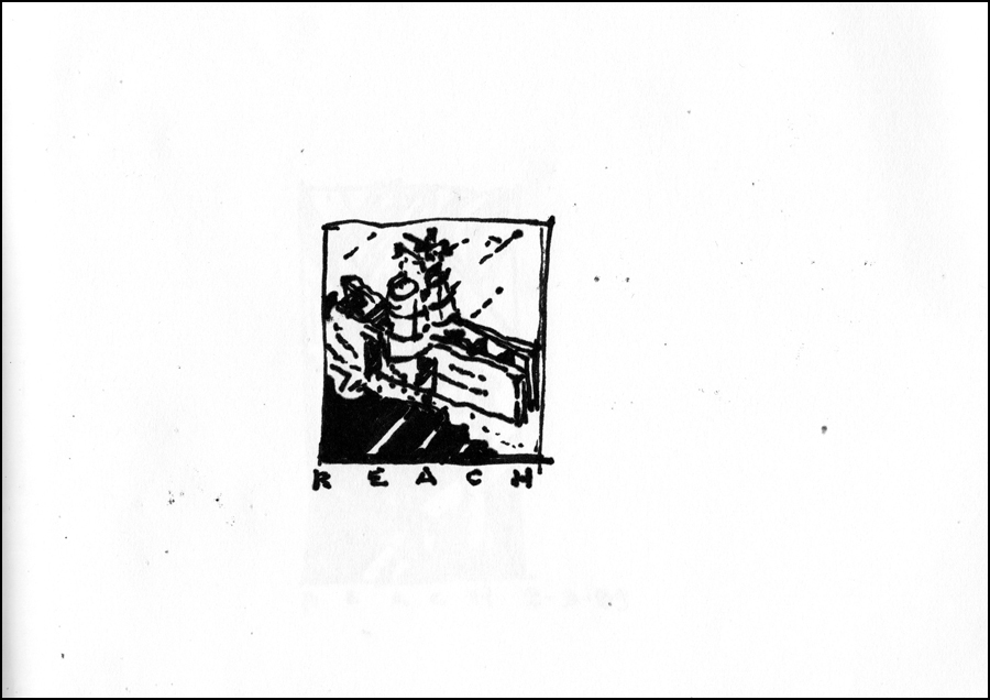
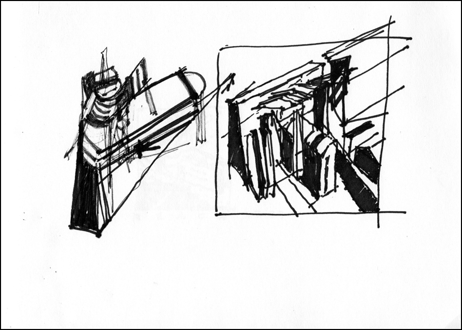
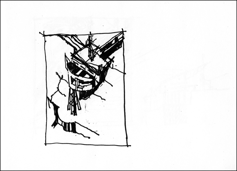
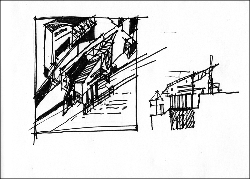
Bruce found a sketchbook. I remember one night after a day at work where I had been working on designing a house that floats above a steep hillside with the support of 4 large columns, I thought about structures and I did these quick sketches. It’s interesting to rediscover things we did a long time ago.

Pratt Project With Visiting Professor Mexican Architect Enrique Norton

Health/Gym Complex
Pratt, 1985

Scanning some projects from my past. Another Pratt project. The Mexican Architect Enrique Norton, founder and principle of Ten-Arquitectos, was my studio professor for this one.

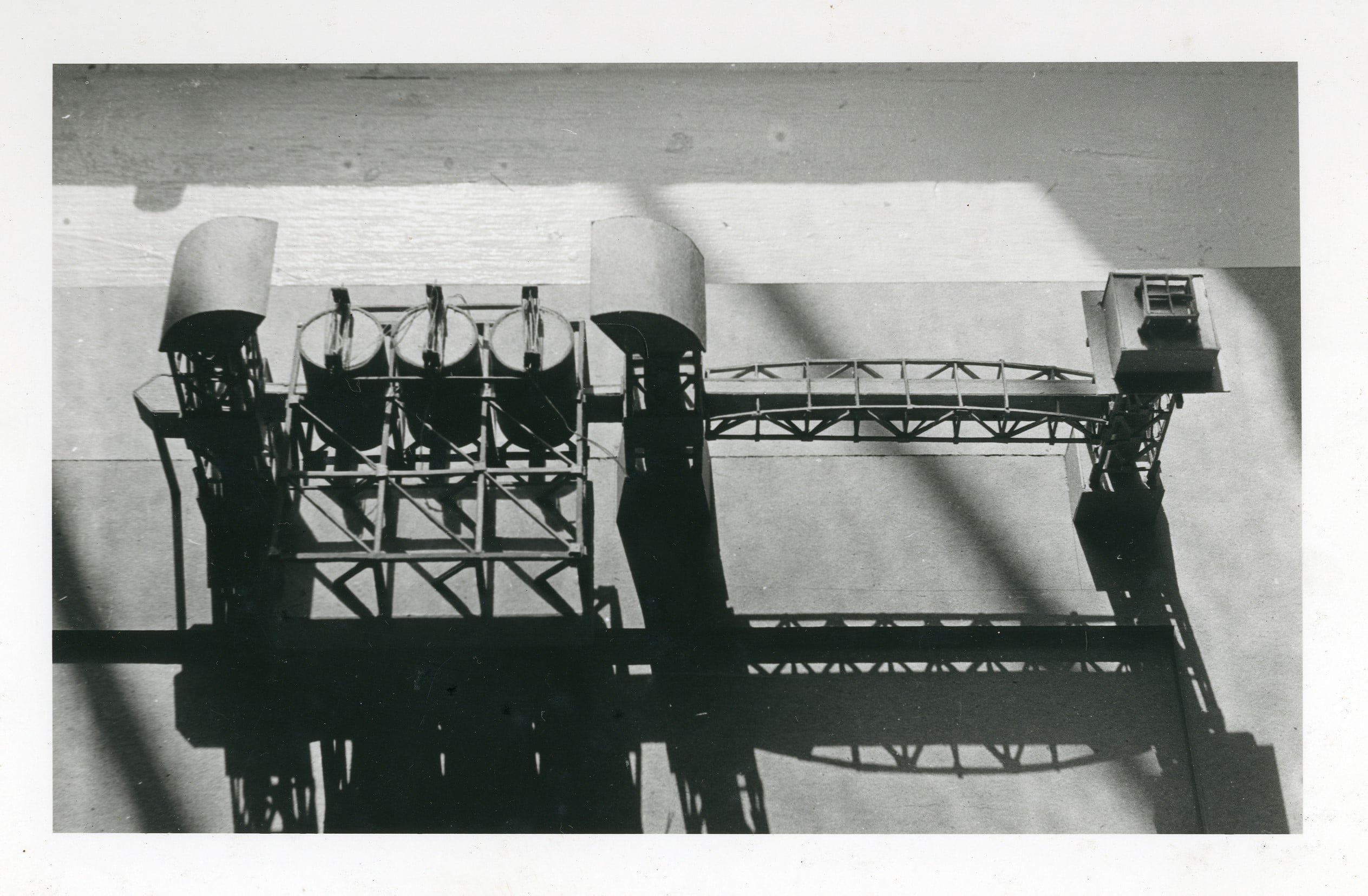
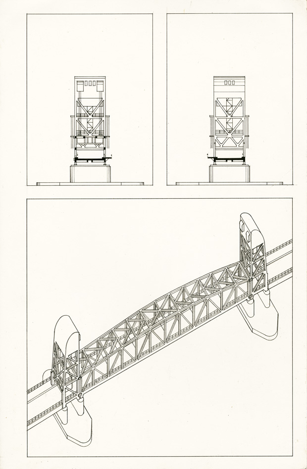
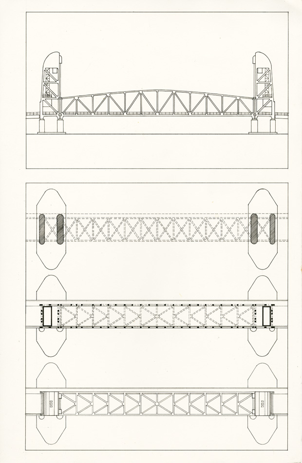
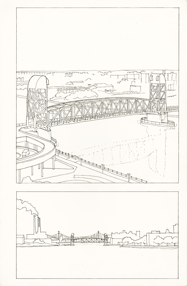
Enrique Norton asked us to look at structures not designed by architects but by engineers; that these structures epitomized modernity. We were to choose a structure and create a transformation of it into a conceptual building. But first we were to document the structure and draw it as a way of understanding it’s structure and how it was built.

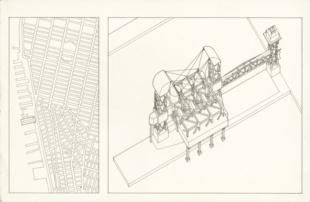
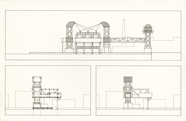
I chose the Roosevelt Island Bridge for my transformation into a building; my building being a health/gym complex. Roosevelt Island is a narrow island in New York City’s East River. It lies between Manhattan Island to its west and the borough of Queens on Long Island to its east. The bridge is a lift bridge (center section lifts up to allow large vessels through) and connects Roosevelt Island to Queens.

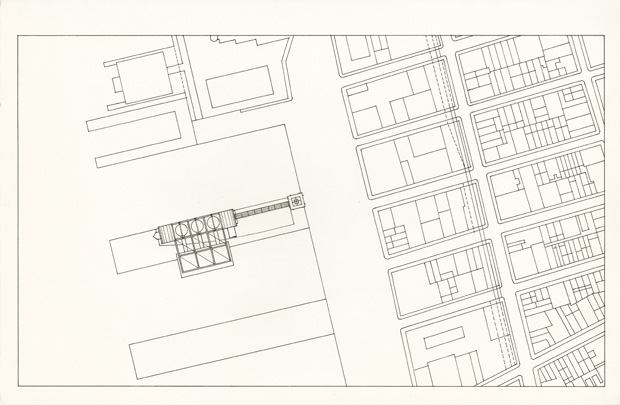
I chose to put my building on Pier 51 on the Hudson at West Street and 13th Avenue. This pier was demolished and replaced with what is now called Pier 51 Playground. The irony is that the Chelsea Piers a little farther north was transformed in the late 90’s into what is now the Sports Center at Chelsea Piers.

Norton gave us a format; 11 x 17 strathmore paper. All drawings were to be done in ink. Ink is so unforgiving. A mistake and you have to start the sheet over. Yes the good old days before Computer Aided Design & Drafting (CADD).

click on images to enlarge

Context Map & Axonometric


Site Plan


Elevations and Section


07-EnriqueNorton-Studio_RooseveltIslandBridgeTransformation-modelModel


Below are drawings of Roosevelt Island Bridge

Sections and Axonometric


Elevation and Plans


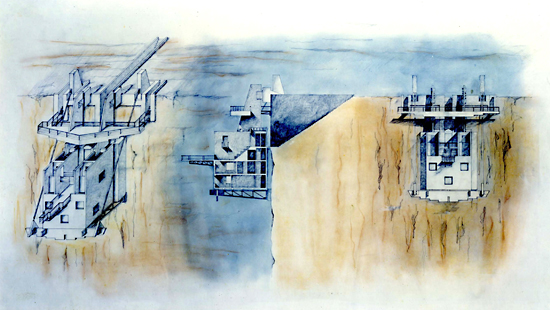
Finding Freedom Through Architecture – HOUSE THAT WANTS TO FLY

Looking Back

I thought hard about the project my Pratt studio professor Hanford Yang handed me, to design a house that when completed felt like it belonged on a chosen imaginary site. But I wanted to do more than just that. I wanted the house to tell a story of why it belonged where it was placed.

I find a kind of freedom in my art that helps me escape pain. As I look back on this project I realize that I was doing the same thing with my architecture. The curvature of my spine in my twenties caused many episodes of pain. The conception of this house, about the desire to escape gravity, TO FLY, TO BE FREE, but not being able to, always tethered to earth, was the story I was telling and a metaphor for the human condition. But perhaps subliminally, it was a metaphor for my deformed spine, wishing I could escape it. Below is the house’s story. Scroll down further to see the drawings and model.

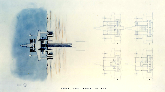
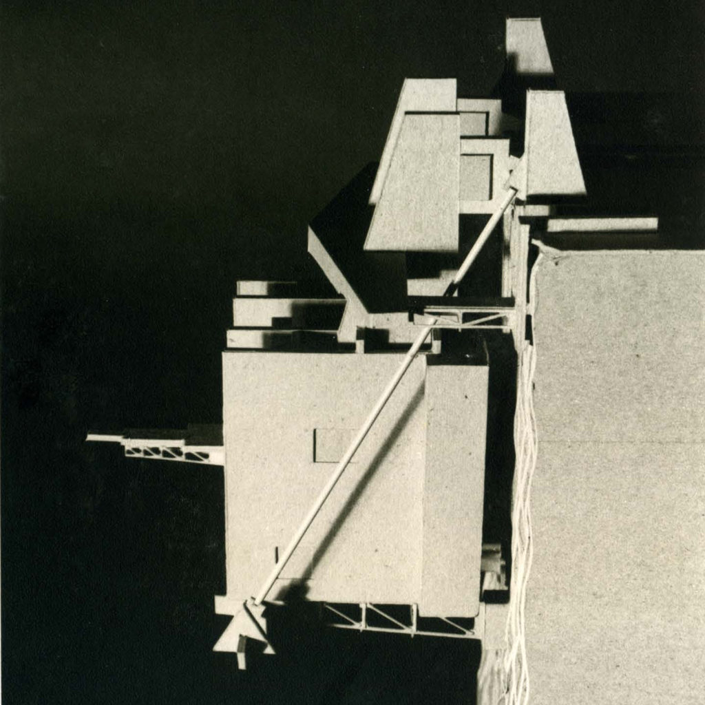
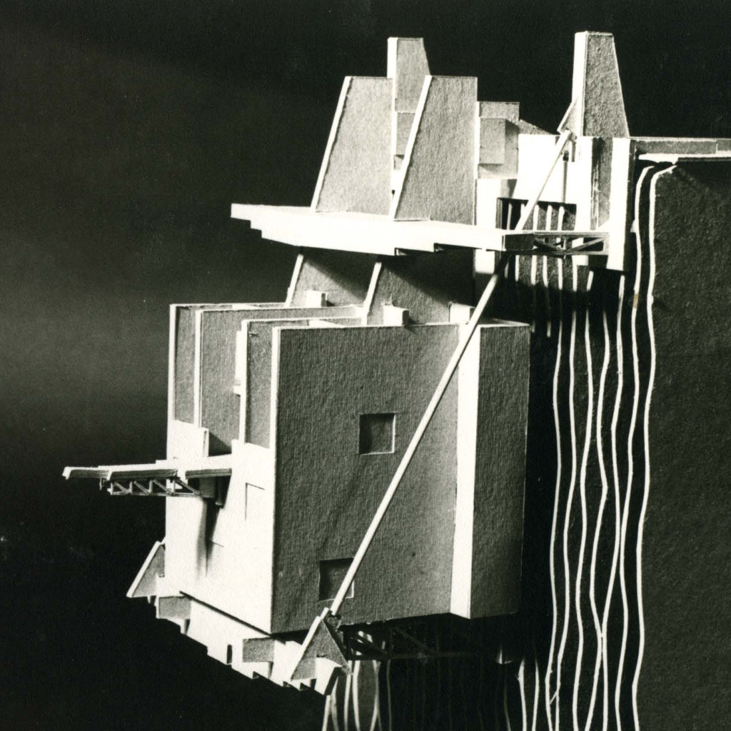
HOUSE THAT WANTS TO FLY

Along a sheer cliff where the pale between earth and sky is sharply delineated, the house precariously hangs by tenuous cords.  Perched with the inflection of motion, it patiently waits to take flight.

The body of the house is dispositioned in a symmetrical arrangement as a pretense of stability.  The long staircase descending through the earth, leads to the entry of the house, continues again, and is culminated by a bridge cantilevered out in space. Secondary staircases lead to a wing-like observation deck. This assemblage of parts is a clever trick.  They construct a “flying machine” imagery so that flyers overhead may be fooled.  However, from a more earthly perspective, the house is a mere building.

Like gravity, freedom is a constant endeavor to be maintained.  Never will the house be able to escape this earth binding force, but the essence of its form is the quintessential emotion of freedom:  FLYlNG.

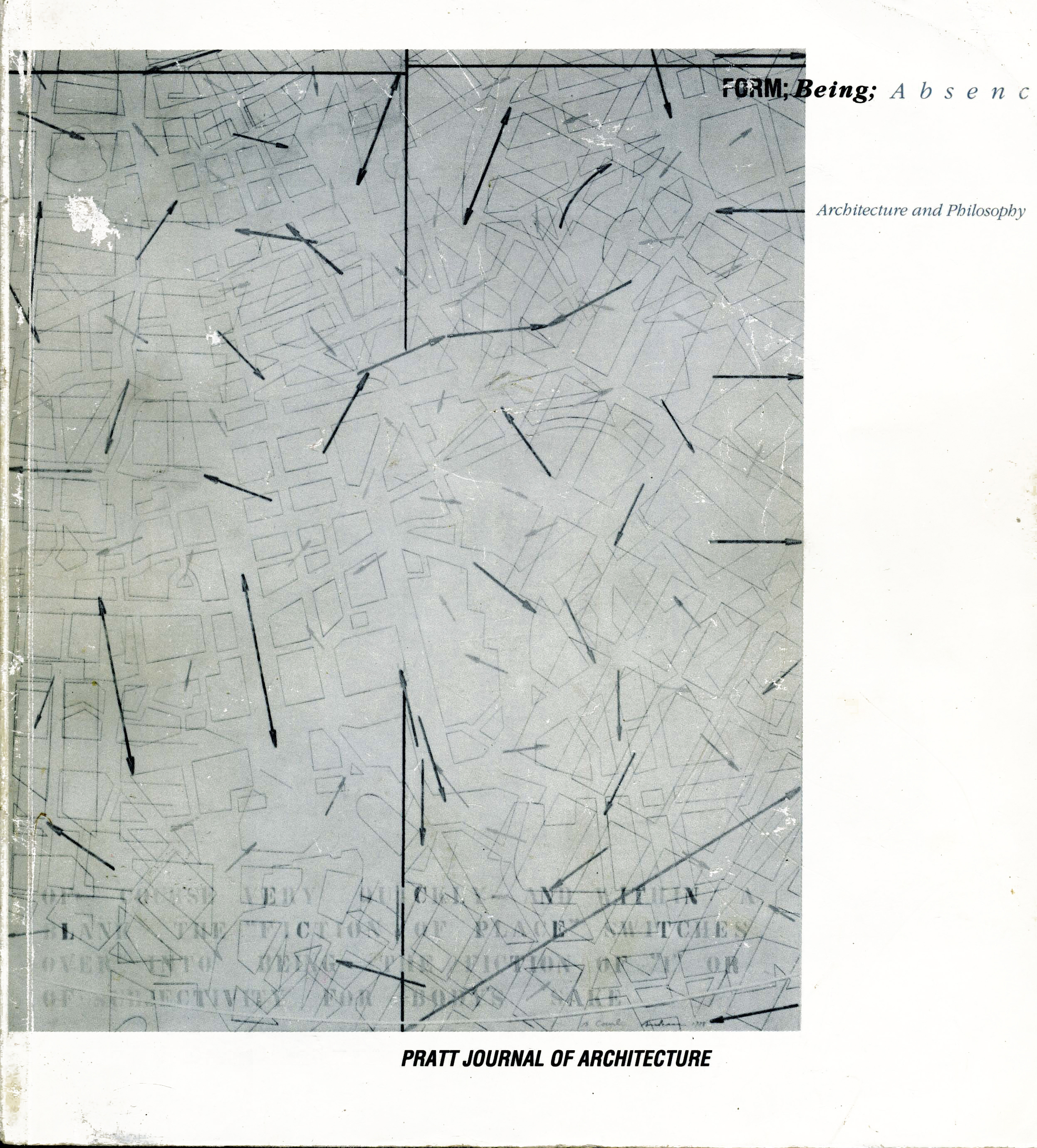
I was honored when this project was selected among only four student projects to be in the book published by Rizzoli FORM; BEING; ABSENCE, Pratt Journal of Architecture, 1988
Click here to see the book on Pratt’s website

click on images to enlarge (except mobile devices)

Site Plan & Floor Plans

Axonometric, Section & Elevation

HouseThatWantsToFly_model1


HouseThatWantsToFly_model2

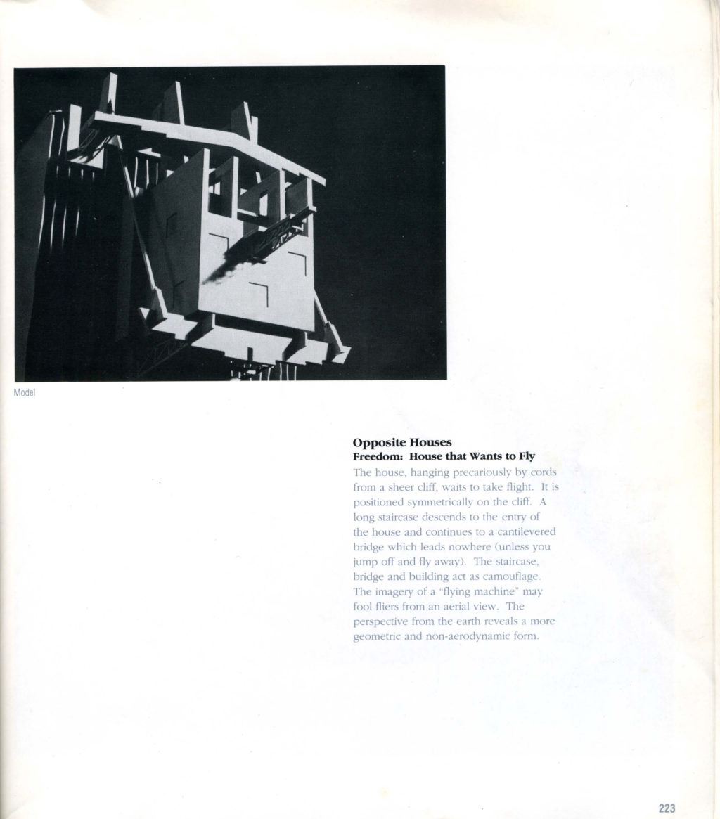
Model

pratt_journal_housethatwantstofly

From the Book “Form; Being; Absence – Pratt Journal of Architecture
Published by Rizzoli 1988
pratt_journal_cover

Front Cover of “Form; Being; Absence – Pratt Journal of Architecture
Published by Rizzoli 1988