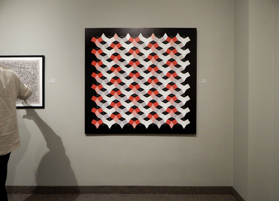
Quadrata Rotata, 2016
Epson Ultrachrome GS Print on Canvas
62 x 54 inches, edition of 3
Abstract Artist Working in the Realm of Digital Media
Reinvention documents the stories of five artists who have reinvented themselves and their work in order to overcome limitations forced on them because of traumatic injury, aging or disease. The acceptance, adaptation and growth that each underwent as part of the crisis process resulted in the production of powerful, original bodies of work in divergent directions.
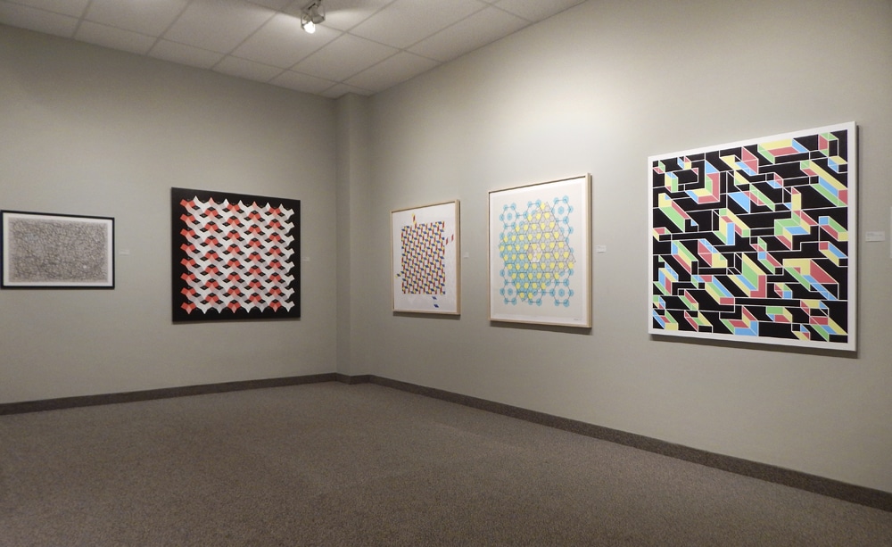
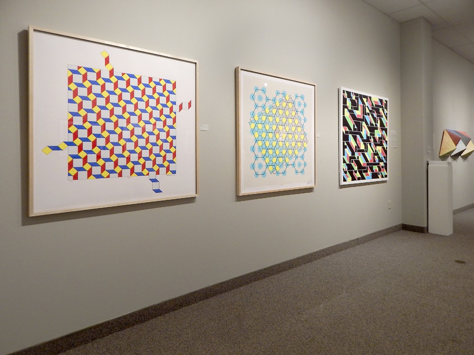
Four and Construct 045.15
archival epson ultrachrome pigment prints on cotton rag paper
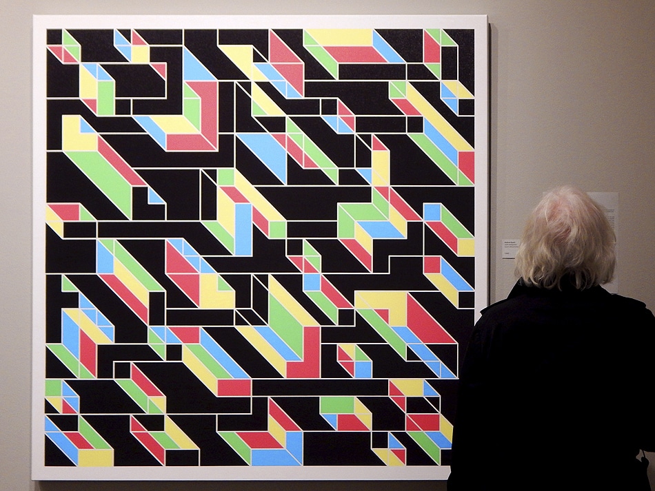 Solid Ambiguities, Epson Ultrachrome GS Print on Canvas
 Construct 002.16 – Diamonds in the Rough
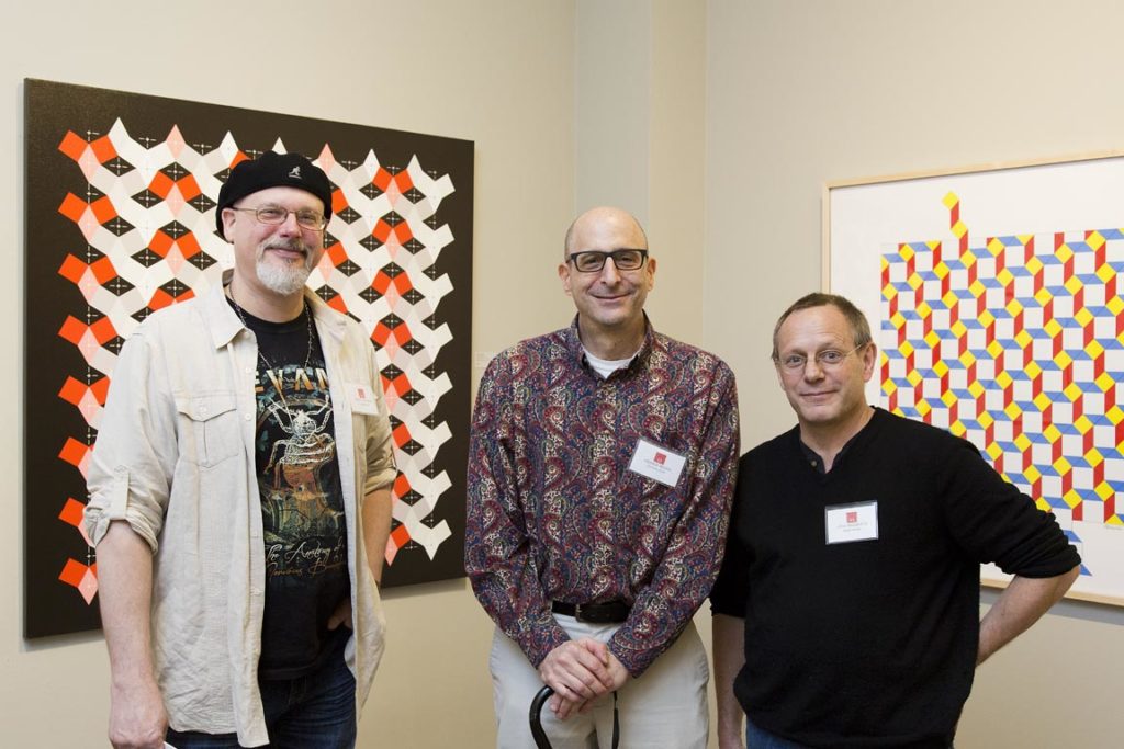 from left: Artist Terry Klausman, me, artist John Sargent III
photography by Stuart Pearl
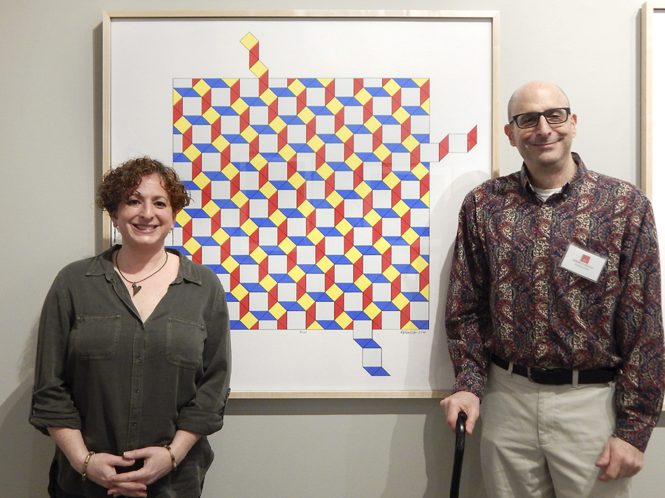 with artist Deborah Silver and the work Four
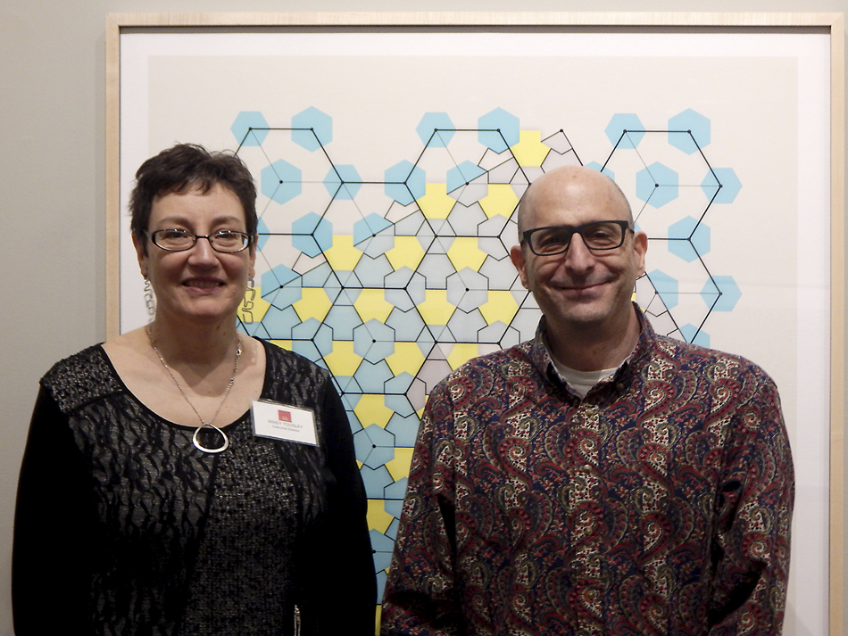 With Mindy Tousley, Artist and Executive Director of the Artists Archives of the Western Reserve
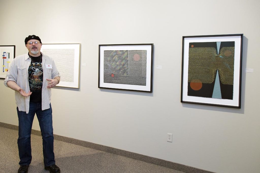 Artist Terry Klausman with some of his works
photography by Stuart Pearl
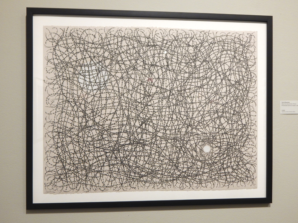 Moonrise Beyond the Thicket by Terry Klausman, prisma color pencil on paper
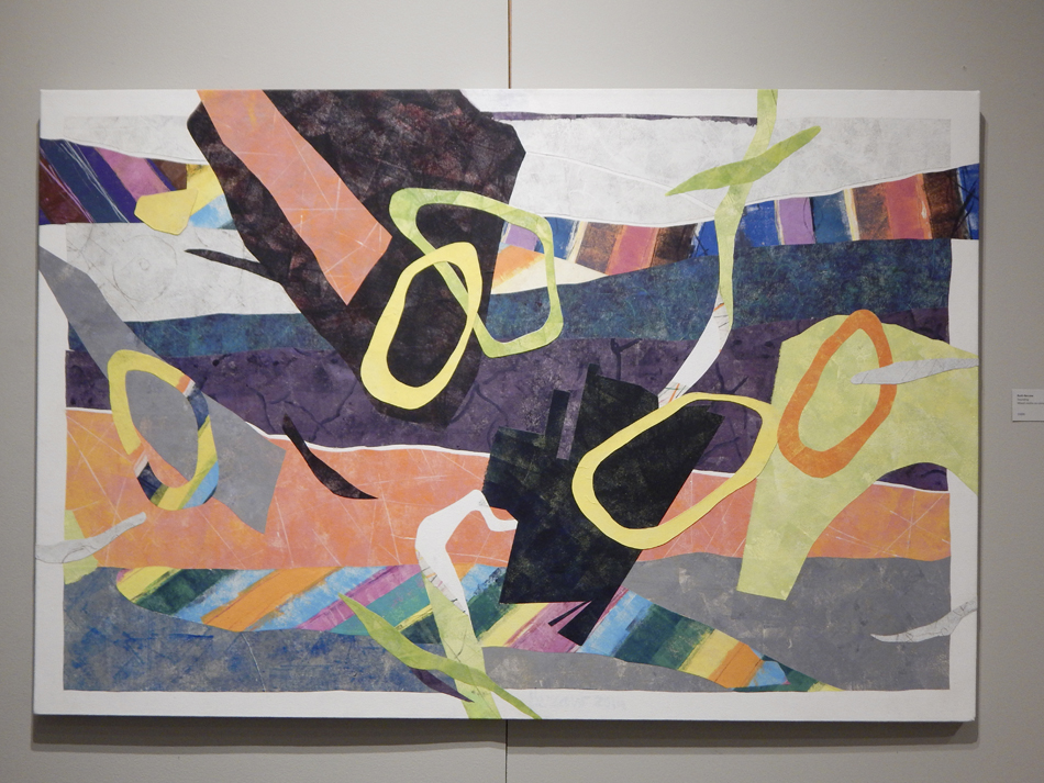 Sounding by Ruth Bercaw, mixed media on canvas
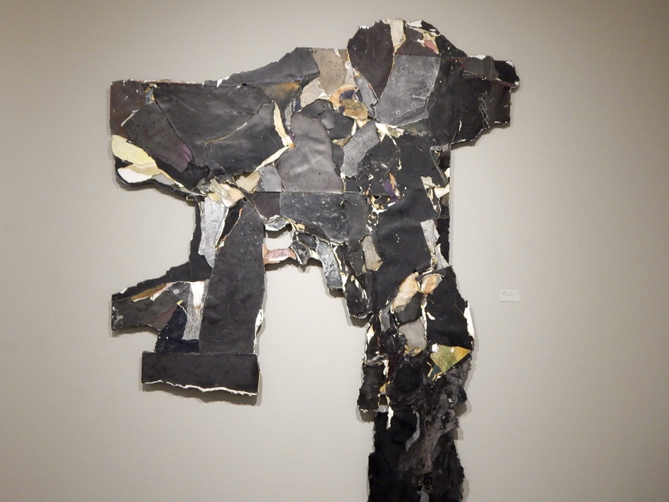 Corpus by Kim Bissett, mixed media paper relief
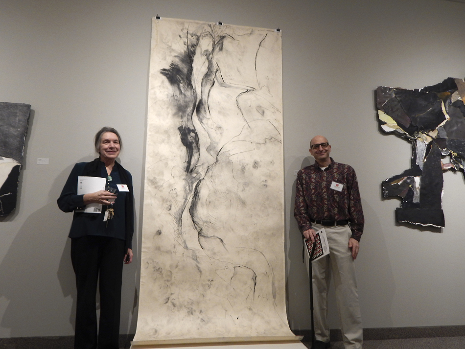 Kim Bissett and me with her work Spring Day, charcoal and mixed media drawing on paper
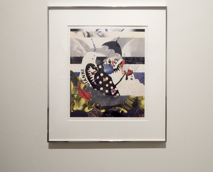 I Clasp My Umbrella Firmly by PJ Rogers, electrostatic print, collage on paper
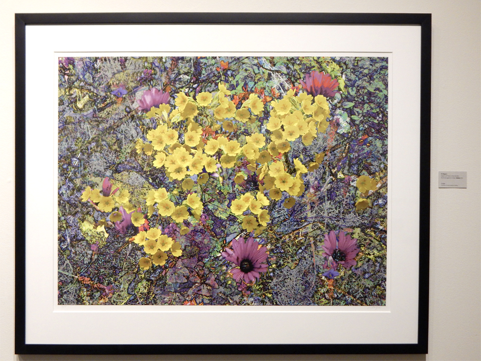 digital work Layers of Time in the Garden 4 by PJ Rogers, archival injet print on paper
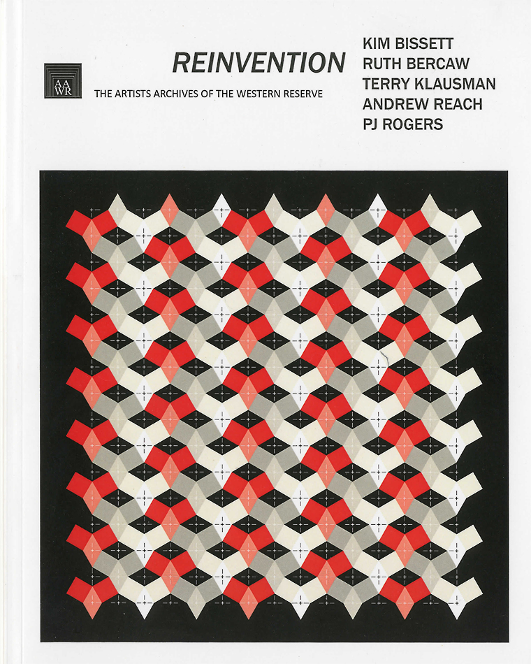 Catalog Cover with Diamonds in the Rough
My generation, the baby boomers, bridged the span between the old analog world and the digital world that would supplant it and this would be an important part of my creative development. As a child I was exposed to architecture when I discovered the blue prints of our house that was buried behind a rack of clothes in my parent’s closet. These drawings fascinated me. But I was also lucky to have been exposed to modern art as well through the lithos of modern artists that hung in our home and visits to my mother’s cousin, an art dealer, starting me on a lifelong love of art. She would take me in front of a piece of artwork in her collection and teach me how to see in a way I hadn’t before. Fast forward to college where I decided that I would study architecture and my early exposure to modern art would serve me well in learning to design. At that time (1980) architects learned to draft by hand with conventional drafting tools (parallel ruling bar, triangles, protractor, mechanical pencils, rapidograph pens). But also at that moment, was the birth of CADD (Computer Assisted Design and Drafting) and I had the opportunity to be an early adopter of computers in architecture at its earliest stage with a CADD program on a main frame at Pratt’s computer lab. Digital technology would progress at a rapid pace with the dawn of the age of the Personal Computer. But as technology progressed, a spine disease also progressed during my 20 years as an architect, leaving me disabled and unable to continue the rigors of practicing architecture.
After a second surgery and severed from my profession, pain took control of me both physically and emotionally and I slipped into a deep depression. Then, at the urging of my life partner Bruce Baumwoll, I began to learn Photoshop. I started to use it to make greeting cards, employing images from Bruce’s collection of vintage ephemera. Photoshop was quite different than the CADD software I used in architecture, being a raster program instead of a vector program and required me to adjust to a new way of drawing. The creation of these cards was a transition to what would become making original digital art from scratch. Magically a rich vocabulary of artistic expression began to spring forth. Bruce, seeing something special happening, purchased a large format Epson fine art printer for me. Bruce had an ulterior motive. He helped me print my work and hung them up all around the house to inspire me further and give me hope of a new path for me going forward in my life.
I have come to embrace digital technology to create large format works that would be too physically demanding for me to paint. With Epson Large format fine art printers, I produce my works in editions of three. An outgrowth from my architecture, through geometric abstraction, I’m interested in bridging the realm of the artist and technician and merging these together to create an aesthetic that speaks to modernity in the digital age. Using color and geometric fragments akin to bits, I recombine them, in a visual dance of color, composition and optic play to imbue in them a kinetic sense of movement; a stand in for my inability to move freely through the world without pain.
As I contemplate what it means to be human in today’s technological world, I embrace technology to help me express myself and have a voice. For me, digitally created art must be rendered as a physical print to make it a tangible instead of a virtual object, thus bringing the digital back to the analog in the age old custom of hanging a picture on the wall to be viewed and appreciated as an object of beauty, something that a computer screen cannot match.
Evie Zimmer, an artist whose work I admire greatly, has been sharing pictures of the progression of a painting. The creative duo, Laura and Gary Dumm, have also been sharing the progress of paintings in a amazing series they are making. Wonderful to get an inside look at the making of an artwork.Wonderful to get an inside look at the making of an artwork. And I thought perhaps I could give a look inside my work. So in that spirit I created this post.
Here’s a screenshot of what I’m working on currently. It’s organized on a grid. Columns are designated with numbers; rows with letters. There are 14 columns and 14 rows for a total of 196 units. With this, every unit can be located. Each unit has two colors; a light color contrasted by a dark color. Units have a titled square with the tilt alternating between units from 60 degrees to 30 degrees. Between contiguous units, dark colors always abut against light colors. I don’t have a title yet but it’s photoshop file name is 010b_2016.psd
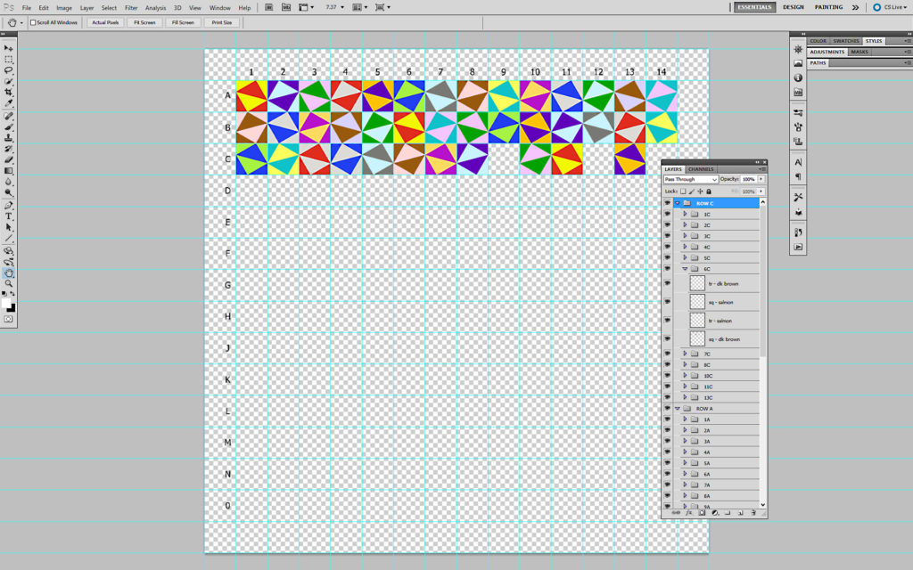 screenshot
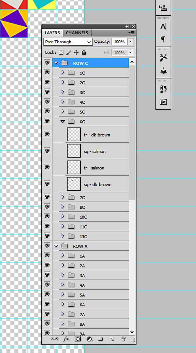 screen shot – layers
Health/Gym Complex
Pratt, 1985
Scanning some projects from my past. Another Pratt project. The Mexican Architect Enrique Norton, founder and principle of Ten-Arquitectos, was my studio professor for this one.
Enrique Norton asked us to look at structures not designed by architects but by engineers; that these structures epitomized modernity. We were to choose a structure and create a transformation of it into a conceptual building. But first we were to document the structure and draw it as a way of understanding it’s structure and how it was built.
I chose the Roosevelt Island Bridge for my transformation into a building; my building being a health/gym complex. Roosevelt Island is a narrow island in New York City’s East River. It lies between Manhattan Island to its west and the borough of Queens on Long Island to its east. The bridge is a lift bridge (center section lifts up to allow large vessels through) and connects Roosevelt Island to Queens.
I chose to put my building on Pier 51 on the Hudson at West Street and 13th Avenue. This pier was demolished and replaced with what is now called Pier 51 Playground. The irony is that the Chelsea Piers a little farther north was transformed in the late 90’s into what is now the Sports Center at Chelsea Piers.
Norton gave us a format; 11 x 17 strathmore paper. All drawings were to be done in ink. Ink is so unforgiving. A mistake and you have to start the sheet over. Yes the good old days before Computer Aided Design & Drafting (CADD).
click on images to enlarge